5 UX Principles That Turn Visitors Into Patients
When patients search online for a new dentist, first impressions form in milliseconds. A website that loads slowly or buries crucial information won’t just frustrate visitors, it can send them straight to a competing practice. In today’s local-first, mobile-heavy landscape, user experience (UX) design is as critical as clinical expertise. Below we’ll explore the hidden costs of a sub-par dental website and break down five UX principles that directly influence patient trust, bookings, and lifetime value.
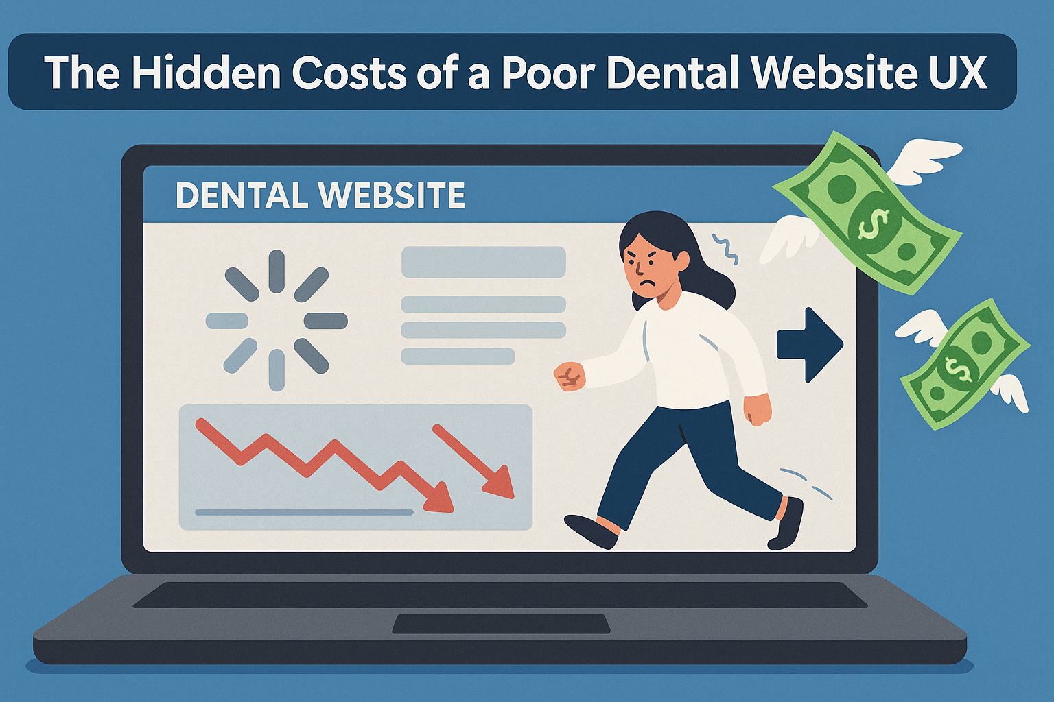
The Hidden Costs of a Poor Dental Website UX
1. Lost New-Patient Revenue
Patients landing on a cluttered homepage often abandon within seconds. According to a Crazy Egg eye-tracking study, 70% of users focus on a website’s left upper quadrant first, if key info (phone, hours, booking button) isn’t there, you’re losing conversions. For a practice averaging a $1,000 lifetime value per patient, ten lost bookings a month equals $120,000 in missed revenue annually.
2. Damaged Trust and Perceived Quality
Healthcare decisions hinge on credibility. A Stanford Web Credibility study found that 75 % of users judge a business’s trustworthiness based on site design alone. An outdated layout, broken links, or blurry photos subconsciously suggest outdated equipment or clinical practices, making price shoppers even more skeptical.
3. Lower Local SEO Rankings
Google’s Page Experience signals (Core Web Vitals, mobile friendliness, HTTPS) feed directly into ranking algorithms. Slow site speed and intrusive elements hurt both engagement metrics and organic visibility—preventing your practice from appearing in the coveted local pack.
4. Higher Marketing Costs
When organic traffic stalls, practices compensate with expensive paid ads or promotional mailers. Yet if landing pages still suffer usability flaws, cost-per-acquisition (CPA) skyrockets. Investing in UX reduces the dependence on paid traffic and boosts return on ad spend.
5. Accessibility & Legal Risks
An inaccessible website (no alt text, low contrast, non-keyboard navigation) can trigger ADA lawsuits, legal fees apart, negative press erodes community goodwill. Inclusive design avoids these pitfalls and widens your patient base.
5 UX Principles All Dental Websites Must Master
Principle 1: Clarity Beats Cleverness
What It Means
Visitors land with a problem (“I need a cleaning,” “I broke a tooth,” “I’m scared of the dentist”). They need assurance fast. Avoid jargon-filled headlines (“Aesthetic Oral Architecture”) and ambiguous navigation (“Solutions”). Use concise, patient-centric language.
How It Impacts Patients
Clear value propositions (“Gentle Family Dentistry Open Evenings & Weekends”), transparent pricing (“In-office whitening from $399”), and prominent calls-to-action (CTA) (“Book Your Appointment”) reduce cognitive load. The easier it is to understand services, the more likely nervous prospects are to convert.
Quick Fixes
-
Place a short tagline beneath your logo describing specialty and suburb.
-
Use action-focused button copy: “Schedule Cleaning” outperforms “Submit.”
-
Replace stock photos of anonymous smiles with labeled procedure galleries.
Principle 2: Speed Equals Satisfaction
What It Means
Patients often visit on mobile during work breaks or in dental emergencies. Google research shows 53 % of users abandon sites that take longer than three seconds to load. Core Web Vitals benchmarks: LCP < 2.5 s, INP/TTFB < 200 ms are non-negotiable.
How It Impacts Patients
A sluggish site heightens anxiety (“If their website is slow, how modern is their equipment?”). Conversely, a lightning-fast experience feels professional and trustworthy. Speed also improves accessibility for patients on limited data plans.
Quick Fixes
-
Compress X-ray and before-after images with next-gen formats (WebP, AVIF).
-
Use critical CSS inlined, defer non-essential JavaScript (chat widgets, reviews carousels).
-
Implement global CDN hosting and server-side caching.
Principle 3: Mobile-First Navigation Builds Trust
What It Means
Nearly 70 % of local health-care searches occur on mobile. Thumb-friendly menus, sticky “Call Now” buttons, and collapsible FAQs reduce pinch-zoom frustrations.
How It Impacts Patients
Nervous patients appreciate quick access to sedation options, insurance info, or emergency contacts. A seamless mobile flow converts “searcher” to “caller” in one tap—vital when someone chips a tooth at 11 p.m.
Quick Fixes
-
Use a 44 × 44 px minimum tap target for all menu items to prevent mis-clicks.
-
Place phone icon and online-booking link in a persistent footer bar.
-
Implement schema markup for breadcrumbs so Google shows mobile-friendly site links in SERPs.
Principle 4: Social Proof & Transparency Ease Anxiety
What It Means
Dentistry triggers apprehension; authentic reviews, star ratings, and clinician bios give patients confidence. UX design must foreground testimonials, Google reviews, and before-after imagery while adhering to privacy rules (HIPAA).
How It Impacts Patients
Seeing a five-star review from a fellow anxious patient or a parent praising pediatric care builds empathy. Detailed bios with professional photos and credentials humanize clinicians—reducing first-visit jitters.
Quick Fixes
-
Embed a rotating reviews widget high on service pages, not buried on “Testimonials.”
-
Add TrustPilot or Google badge near CTAs.
-
Include a short video intro where dentists discuss their gentle approach and favorite local causes.
Principle 5: Accessibility & Empathy Make UX Inclusive
What It Means
Accessibility guidelines (WCAG 2.2) ensure patients with visual, auditory, or motor impairments can interact with your content. Color contrast, screen-reader labels, keyboard navigation, and captioned videos broaden reach.
How It Impacts Patients
An accessible site signals empathy—essential in healthcare. Dyslexic visitors read easier with larger line heights; older patients with low vision appreciate high-contrast buttons.
Quick Fixes
-
Use an accessibility checker (WAVE, axe) to find missing alt text or low-contrast elements.
-
Provide downloadable forms in PDF and screen-reader-friendly HTML.
-
Caption all procedure explainer videos and add transcripts below.
Putting the Principles to Work: A Mini-Audit Walk-Through
Imagine “SmileBright Dental,” a suburban practice with:
-
4-second homepage load time
-
Service pages buried in a dropdown; phone number hidden on desktop only
-
No structured review display, only a Yelp link
-
Stock photography and tiny font sizes
Applying our five principles:
| UX Issue | Principle | Fix | Projected Impact |
|---|---|---|---|
| Slow hero slideshow | Speed | Replace slider with single compressed image | -1.5 s load, +12 % conversions |
| Confusing nav labels | Clarity | Rename “Solutions” to “Services,” add “Emergency” tab | +30 % page views to emergency form |
| Missing mobile CTA | Mobile-First | Add sticky “Call Now” and “Book Online” | +45 calls/month |
| Reviews hidden | Social Proof | Insert 5-star Google widget above fold | +18 % form fills |
| Poor contrast, no alt text | Accessibility | Update palette, add alt descriptions | Reduced bounce on older-age demo |
Measuring Success: UX Metrics That Matter
-
Core Web Vitals (PageSpeed Insights)
-
Mobile Click-to-Call Rate (GA4 Events)
-
Time on Procedure Pages (dwell time indicates clear info)
-
Conversion Rate (online bookings ÷ landing-page sessions)
-
New-Patient Acquisition Cost (marketing spend ÷ first-time appointments)
Positive shifts in these metrics prove UX ROI.
Frequently Asked Questions
Q1. How often should a dental website undergo a UX audit?
At least twice a year, plus after any redesign. Google algorithm updates and patient tech habits change quickly.
Q2. Is a website template enough, or do I need custom UX design?
Templates are fine if they’re optimized for speed, accessibility, and conversion, just ensure you tailor content, imagery, and CTAs to your unique patients.
Q3. Do core web vitals really affect dental rankings?
Yes. Google confirmed that LCP, INP, and CLS are direct ranking factors in the Page Experience update. Faster, stable pages get preferential treatment in local results.
Q4. Can online chat harm UX?
Not if implemented properly (fast load, mobile-friendly, no intrusive pop-ups). Use asynchronous chat so patients can text follow-up questions without staying on the page.
Q5. How do I ensure HIPAA compliance for reviews and testimonials?
Obtain written patient consent; avoid revealing PHI without permission; embed third-party widgets that automatically mask sensitive data.
Final Thoughts—and Your Next Step
Neglecting user experience costs dentists in ways that aren’t always obvious: lost trust, lower Google visibility, and escalating ad spend. By applying clarity, speed, mobile-first design, social proof, and accessibility, you transform your website from digital brochure into a 24/7 patient-generation engine.
If you’re unsure where to begin, clickguru offers a free UX and SEO audit tailored to dental practices. We’ll pinpoint speed bottlenecks, intent mismatches, and conversion leaks, then deliver an action plan that turns visitors into loyal patients. Book your complimentary audit today and make every online interaction as painless as your cleanings.